Tuesday, December 27, 2011

Xu De Jia Small Chawan Celedon Cups

Celadon Cup Pair (1)

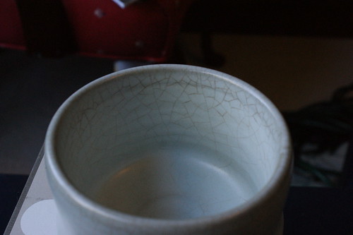
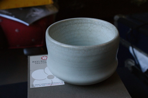
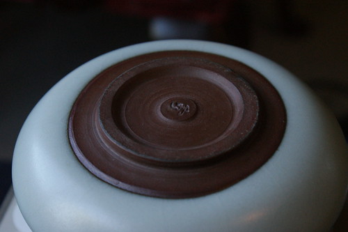
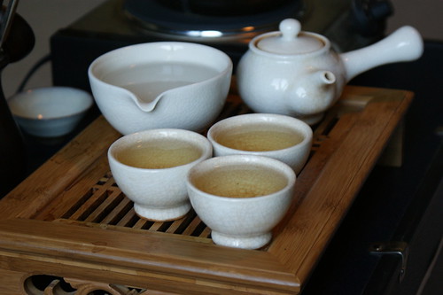
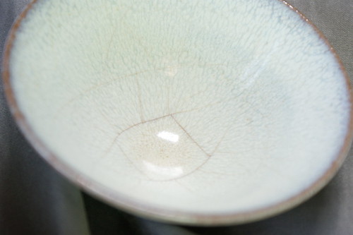
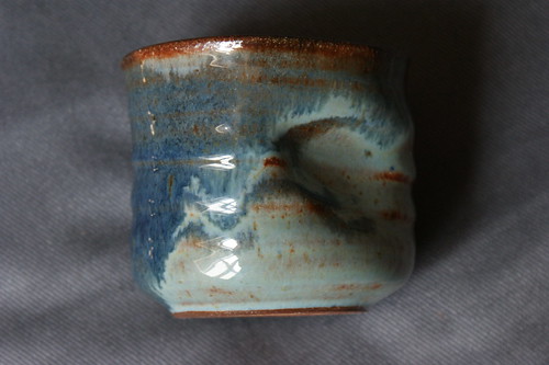
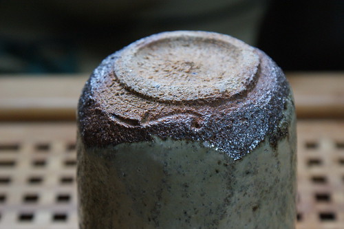
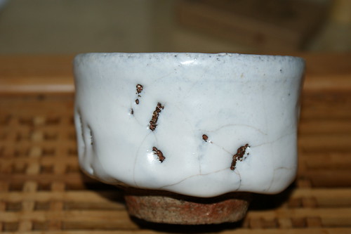
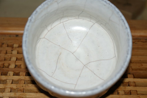
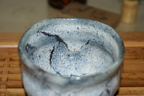
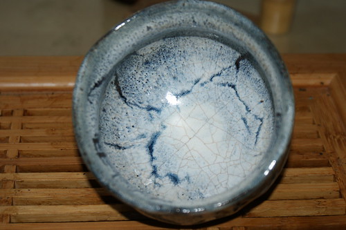
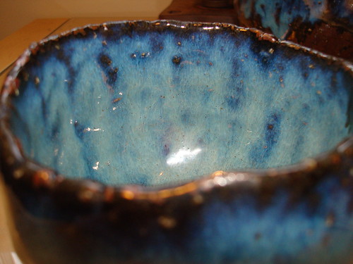
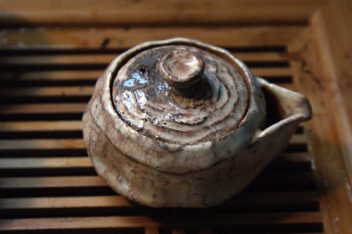
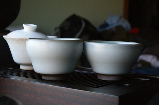
A Chistmas gift from my parents, these 50 ml celadon cups are the 2nd (and 3rd) pieces of celadon ware I have.  There are many types of celadon, ranging from super glossy almost glassy looking, to this satin type of finish.  The colors can also vary wildly from an almost blue color, to pale white, I have even seen some slightly brownish grey pieces.

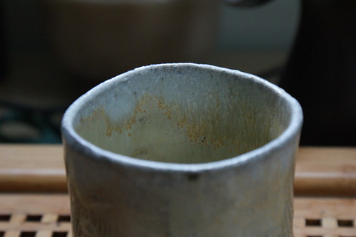
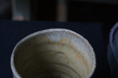
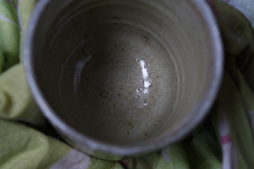
The funny thing about these cups, is it was not until I took the above picture and looked at it, that I realized how incredibly different these two cups were.  Yes they are the same basic shape, same color, but I honestly never fully realized that one is slightly shorter but much wider, while the other is more upright and taller.  Its small details like those that give me a bit of comfort that yes these are actually hand made.  And the differences are only noticeable when you have them side by side.  If you held one in each hand, about a foot apart from each other, and looked at the one in each hand one at a time.  In that situation I think almost anyone would deem both pieces identical.

Celadon Cup Pair

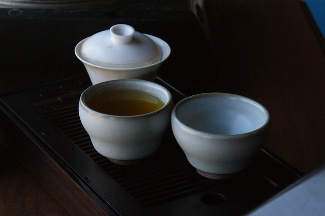
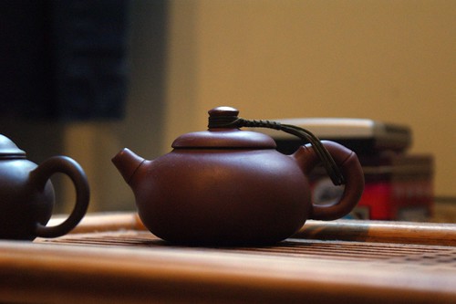
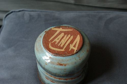
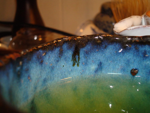
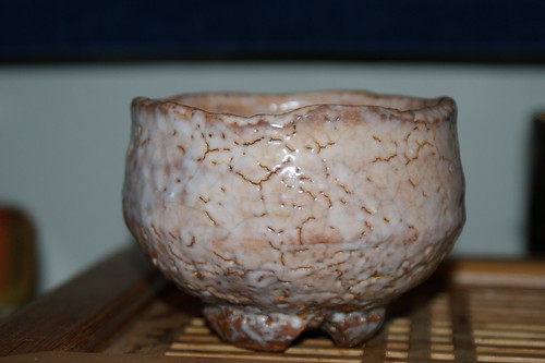
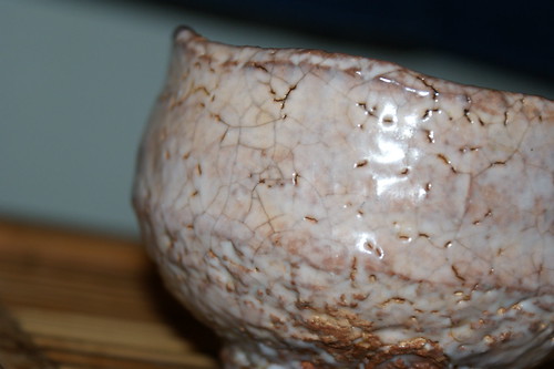
These pieces just reaffirm my new found fondness for celadon, although all 3 pieces I have are from the same artist Xu De Jia.  And I am quite fond how (at least in this slightly aqua marine colored glaze) at the very rim of the cup there is a noticeable difference in the glaze.

Tuesday, November 29, 2011

Shibuya Eiichi Wood fired Yunomi

Eiichi Woodfired Yunomi

I believe this is my first wood fired piece, from a young artist that is quickly making a name for himself both in the US and in Japan.  This Yunomi shows his incredible talent in so many ways.   While obviously wheel thrown, the way in which he did not overly smooth out the sides of the cup, and left decent curling ridges working their way up the sides of the cup, creates an almost ideal grip on this otherwise slippery piece.  So much so that with my somewhat large hands, with an empty cup, I can manage to hold it (not incredibly well)     with just my middle and ring  fingers curled around one side, pressing it against the pads on the palm side of my knuckles.


Eiichi  Woodfired Yunomi(2)

The piece seems so ideal in how it fits into my hand, feels surprisingly light and soft for its size, that I am just absolutely thrilled.  Even more so it has some characteristics I have long since wanted from a White Hagi Yaki piece, that only exist when wood fired.   That is the white is actually a subtle pink in most places that darkens or lightens with the effects of what was going on around it in the kiln.


Eiichi Woodfired Yunomi (3)

The biggest con in my eyes, is the foot is quite ugly, and ugly in the sense that it looks like he sanded off a hell of a lot of wadding to smooth out the bottom of the cup.  Which when you look at the foot, it lacks the soft look and feel that the rest of the cup has so much of.  The sanded and smoothed out sections look rough, and raw, and especially scarred.

Sunday, September 25, 2011

Apprentice Red Blossom Yixing

Red blossom Apprentice Yixing

A Yixing teapot that caught my eye when I visited Red blossoms store in San Fransico.  It is a piece that I feel Sen No Rikyu could get behind, because while the piece is not without its flaws (few at that, but still there), it brews good tea, and that is what is important.  Interestingly enough it shows its use quickly, and some of the more apparent flaws are on the inside there are a few odd blemishes in which it is not picture perfect.  There also is a slight drip from the lid while pouring.

Not to mention from a bit of an visual point of view it appears as though at one point in time this pot was dragged across a rough surface before being fired.  As the base is quite scuffed up and has been from the moment I acquired it "new."  While I have no problem admitting I am a novice when it comes to yixing, something about this pot just strikes me.  Most importantly it brews good tea.  

Saturday, August 13, 2011

Xu De Jia Celadon Teabowl

Celadon Teabowl (2)

I have long avoided celadon, not because I didn't like it but because I was worried I would like it too much. There is just something about the soft greenish/greyish blue color glaze looking like a giant marshmallow wrapped around the piece that looks so inviting. Not only that but celadon is notorious for having the cracks in the glaze stain.

Celadon Teabowl (1)

But I was visiting teashops while in San Fransico, and at Red Blossom Tea I saw 3 styles of tea bowls, I sort of wanted one of each and when I called later to acquire one it was tough to decide upon just one. Let me just say I love the satin style celadon glaze, that looks so soft and inviting. It surely takes on stain quickly mine having been in my possession for less than a week already looks quite old and wizened on the inside.

Celadon Teabowl (3)

For being a sizable celadon piece, it is phenomenal, as most celadons of this style are only done on smaller cups, but this one being nearly 4 inches exactly in diameter. It surely is a centerpiece, and I can not wait to attempt to make Matcha in this bowl, although at exactly 4 inches in diameter, it might be a bit tough to adequately whisk inside the bowl.

Friday, July 8, 2011

Set Cohesion?

Jukro Oojeon Color

Most of my teaware is quite piecemeal, in the sense that I have hardly any pieces that match, besides the fact that any grouping of plain white porcelain seems to be a set. Just about all my teaware is a stand alone piece. I basically have no sets besides the one pictured.

Its an interesting question, should someone seek harmony in the appearance of the pieces, in that they are all basically identical. By that I mean same glaze, same shape same everything. I almost find this sort of cohesion almost boring, while somewhat pleasing. I have taken to creating themes with my teaware either based on glaze, shape, or artist.

For example I have a favorite pairing which is all by Deishi Shibuya, pictured below. Two of the pieces are the same glazes, while the third is a different glaze. Its actually a perfect grouping in the sense that its not identical but has a wonderful set of symmetry that it looks like they belong together.

SlantTea

I almost feel these set groupings are best, in the sense that few artists create pieces as part of a set. So these piecemeal groupings might actually be best.

Tuesday, June 14, 2011

Oil Spot Sakazuki

Daisen Sakazuki

This is one of the two Daisen Yaki pieces I have, and it is most certainly stunning. In fact after trying for quite some time to accurately capture the oil spot effect on the inside of the piece, this is the best I could manage. In person it looks so much more vivid, like silver blue veins of some sort of precious stone running through the white glaze of the cup.

Even more amazing is this cup is staining, and I am starting to learn that in fact there are very few glazed ceramics do not stain in such a fashion. Something which I initially believed was exclusive to Hagi Yaki. In fact I am quite looking forward to the staining of this piece, that seems to starting to slowly occur on the outside of the cup, which is a just plain white glaze.

It is this piece which has me wanting to view many more oil spot glazes, as while from a distance they can look plain, up close they seem to almost be captivating.

Tuesday, June 7, 2011

Local Artists

Tanja Cup Denim

Walking around my local city today I found an art festival of sorts which consisted of many potters wares, one of them caught my eye, both in terms of simple shape, and in price. The artist is Jud Tanja, and the cups were sold under the title wine glass, but the shape and size screamed Yunomi to me. Though when talking to the artist he left a remark which was quite comical.

Tanja Cup Dimple

I inquired if he had ever heard the term Yunomi, to which he replied he had not, so I told him it was Japanese term used for Teacups, to which he replied "Teacups can sell for thousands of dollars I just make simple drinking cups, based mostly upon how ugly they are." While I can certainly see this for some Japanese ceramic pieces, especially Hagi. I think it is one of those things where if you are not open to learning to like the pieces for their Wabi appeal, then often they can just apear to be exceptionally ugly cups.

Tanja Cup


This cup though, the more and more I look at it the more I like it. The glaze honestly reminds me of two different colored Denim's that have rust markings on them from working with scrap metal. While I have never been a huge fan of the dimples in the side, the glaze on this is slippery enough, and the dimple just seems to swallow my thumb to the point that the cup becomes a part of my hand, I do not mind it so much with this cup.

This just goes to show you, that occasionally a great piece can be found at the bottom of the basket.

Sunday, May 22, 2011

Rustic Elegance

Biwa Kofuku Wan

There is something about Hagi Yaki which I think these photos emphasize. They are not made with crisp clean lines, they are not covered with a perfect sheet of glaze, they are so simple that even certain artisan made pieces look as though they were made by an amateur potter.

Shira Kofuku Wan

While these pieces are designed to show Wabi Sabi, at the same time they are almost made in such a fashion as to make them seem unpretentious. I can relay a story in which I had a repair man visit my apartment, and upon seeing my collection, had assumed that I made all of them. Trying to always seem modest myself I was unsure whether or not I should correct him, as I did not want to relay exactly how much money was sitting on those shelves, but at the same time I did not want to take credit for others work.

Though it is a bit of an odd comment in certain respects. Looking at me and my age, I hardly suspect he thought I was some highly talented and well practiced artist. So I am uncertain as to whether he thought these pieces were unpracticed, and not that great, or if he thought they were amazing works of art.

Either way, Hagi yaki offers something few other works of art do, and that is a rustic and homelike nature to it, which is still in its almost grotesque way elegant.

Sunday, May 15, 2011

Oh Dear, Karatsu

Kimata Kaoru Yunomi Koudei

"First Raku, second Hagi, third Karatsu" is a known saying in Japan in regards to their preference of teaware. What has always amazed me is how easy it has been for me to find quality Hagi yaki online, but I do not think I have yet seen a Raku yaki piece that is not a Chawan. And while I have found a source for quality Karatsu it comes from only a single artist.

The artist that produced this Karatsu Yunomi is Kimata Kaoru, and I will say it is stunning. I have been branching out from my love of Hagi Yaki. In doing so I have discovered I may have been wrong to believe that I loved Hagi Yaki most of all Japanese teawares.

Kimata Kaoru Yunomi 2

Not only is this a rustic and simple elegance, it also stains. this is two things I loved about Hagi. The colors are much more natural than some Hagi colors. While the glaze does not crawl, at certain times I feel Hagi's crawling is a bit in excess, or comes in colors I do not find favorable. One thing I had loved about Hagi is that it stains in cracks, and shows how much use/ love it has gotten.

Staining Karastsu 2

As seen by these two pictures this Karatsu piece is clearly staining (and quickly too, these photos were taken after 1 session of Sencha). I look forward to seeing this piece change and I can not wait to see how it develops.

Staining Karatsu

Wednesday, May 4, 2011

Buying online

There is a certain site that a lot of us Westerners love when searching for deals on items without having to jump through a large amount of hoops. To try and avoid a bunch of unwanted comments I will spell it backwards to hopefully deter some searches, yabe, now said site has its fair share of flaws, from sellers using a second account, or a friend to bid up the items they are selling to try and get as much money as they can. Others post information which is blatantly false, which of course may be intentional, or they are just passing on information that was told to them.

For instance, there is one vendor who from this description might be able to be guessed somewhat easily, that sells all sorts of Japanese items quite a few of them pottery based. Although in every description they claim that the piece is X years old while the number X changes occasionally, it is still quite amazing as they are always X years old but more often than not in "like new" condition. While I have not been able to concretely determine this vendor has ever lied about the age of a piece, I will say I have probable cause to suspect that the vendor did on at least one piece. (After checking several biographies on the artist of the piece, and cross listing it with age listed of the piece, it would have meant the piece in question was made several years before the artist got interested in ceramics).

But honestly it seems like that vendors biggest flaw is advertising items to be older than they likely are. It could be much worse, on yabe I have seen some pieces that I would consider the equivalent of shoe polish yixing in terms of hagi ware. These pieces were claimed to be antiques, and while I could not vouch for their age, what scared me is it looked like they were repeatedly dipped in mud and wiped clean. There is a difference to how a piece naturally ages and this horrible attempt to falsely age. The most noticeable is Hagi yaki tend to have cracks in the glaze which darken, then through even more use, the liquid in side slowly seeps through those cracks into the body and out the other side staining the cracks on the outside. While this can lead to discoloration in the clay body, I have never seen it cause a piece to look like it was thrown in the mud and wiped clean.

I wish I copied pictures of the pieces in question but I can not seem to find them any more. But this goes for something in general on these auction sites, if something seems over done, too good to be true, or just in general suspect it is always good to be careful.

Wednesday, April 13, 2011

Interior colors

Hakeme Daisen Yunomi with Sencha


It is often said that tea is best presented in a cup with a white Interior. Consider the picture above, in which the Yunomi holds green tea, but the color does not seem to stand out, and almost looks a bit of a repulsive brownish yellow color of stale green tea.

I would like to outline why I both accept and deny the concept that tea should only be presented in a cup with a white interior and talk about when it is okay to ignore that "rule."

The pro's of a White interior:

  1. You have a well defined base color of which you can use to reference the actual color of the tea.
  2. Using that base color you can see the density in the color of the tea, i.e. how the color changes close to the edge where the tea is thinner.
  3. Easy to know if it is clean or dirty.

But white is also boring, so while it should be viewed as a golden standard for a teacup for any sort of tea. Though different colored interiors can do wonders for different types of teas. For example consider how wonderful this tea looks simply because it is held in a cup with a blue interior:

A stuck drip of tea


So while blue interiors do wonders for green teas, making their slightly more natural yellow colors come across as bright vibrant green. It seems darker colored teas look good in a wider variety of cups with interior colors. That is because they tend to be much more opaque and less likely to have the interior color create an off appearance with the color of the tea.

Sunday, April 3, 2011

Wonderful ingenuity

Eiichi Rock (2)

Shibuya Eiichi, the grandson of a known Hagi Artist Shibuya Deishi, is certainly making splashes in certain circles namely those on Teachat which possibly houses the largest collection of Hagi Yaki lovers in the West. It is pieces like his Rocks that honestly show why. While I had always found the rocks visually stunning, I had held off purchasing one on beliefs that it might be a bit more of a show piece than an actual functional piece.

Let me assure you those fears were ill placed, although I will warn that the rocks are not very hot water friendly. They are easily usable with the temperatures necessary for Green tea, but I hear they are quite the finger burner when used with near boiling water.


Eiichi Rock

This piece came from a Teachat Super Special Offer, and was piece number 1 from that offering (not my first pick, but I was quite smitten by just about all of them). These were the first batch of rocks that were done by pinch work (tebineri), and I would have to go back and look at pictures but this one gives a distinctive chamfered look to it, with slightly extra build up to give the full on rock appearance.

In full fledged High praise this might easily be in the running for one of my favorite teacups, in stiff competition with some wonderful pieces, but it clearly holds its own.

Thursday, March 24, 2011

Tragedy in Japan

I had thought long and hard about how to post about this, on my tea blog I made a bit of a call for making the year 2011 a year for Japanese Teas and Teaware. I encourage a similar thing on this blog. Though a bit more tragic is while most of the tea regions where minimally effected by this event, Japanese potters were directly effected by this event.

There is a Potter specific relief fund, found at the following link:


Many people made donations to an auction which is going live tonight in which all proceeds are going to aid Japan.


And Robert Fornell an artist I am quite fond of although I have yet to acquire a piece by him, is donating all proceeds from his Etsy store for the time being.


If people have any other links involving ceramics and relief efforts for Japan please let me know an I will work on keeping this page updated.

Thursday, March 3, 2011

Seigan Ao Tebineri Kyusu

Ao Teb Kyusu

Of all the pieces I have acquired this might be the one I am least happy with overall. I say that because it is almost unusable for its intended purpose. That being said amazing things happen on this piece in terms of glaze, and it is a pinch work piece, and I tend to favor the amazing textures of pinch work pieces. So in detail what are my problems with this piece?

Sadly all the problems are near impossible to see from the photos. The first of all being its Gargantuan size in terms of kyusu's. I mean I have a penchant for large kyusu's but this one is holds roughly 20 oz or more.

Second is the filter has incredibly large holes even for a Hagi Kyusu, and I often joke that when I use this kyusu I am having a salad with my tea (and I only brew Asamushi in this kyusu). Besides that possibly due to the fact that it is in the first few of a new style of Kyusu he was creating, but the spout is poorly formed and dribbles down the front unless I turn it so the spout is practically vertical.


Ao Teb Kyusu close up

Not to mention in my opinion the inside glazing looks incredibly sloppy, and almost unfinished or so in parts. To me it seems almost a bit sloppy in its overall presentation and usability. So for the most part this stays mostly on the shelf, which while it is not so bad to look at, I really wish I could use it more often.

Thursday, February 24, 2011

The Piece Dubbed Frosting

Frosting Side

So the piece posted last week, and the piece from this week have been relegated to office duty, and I only got around to photographing them because I took them home for cleaning. And I do not know what it is but the fact that they are now home and once again sparkling and clean, I have a renewed fondness for them.

This piece is fascinating in many ways. One is in part why it is dubbed frosting, it has an incredibly thick white glaze spread over it, and it undulates in such a way that it looks like frosting hastily applied to the cup. Especially since in a few area's the clay underneath shows through. That is not all this extra thick glaze, seems to do wonders for how it progresses through the seven stages of Hagi.

Any time I have seen cracks in a glaze on a piece, they are usually rather fine, so perhaps it makes it hard to see, but typically a crack runs into another crack, forming T's or X's, though this piece has cracks that run through a piece and dead end as pictured below.

Frosting inside

Though the more this piece is used the better appeal it seems to have. The uniqueness that there are large patches of glaze practically untouched by the staining and the crazing. But the staining appearing on the outside seems oh so welcoming as seen by the first picture. I will be watching this piece develop with much hope, and is the piece I think of when I consider how extra rough clay Hagi pieces (Oni-Hagi) can produce some incredibly interesting effects.

Thursday, February 17, 2011

Ice Split

Ice split side

A glaze that is quite unique, although I am not entirely sure if it was just adapted for Hagi by Yamane Seigan, or if this glaze is uniquely his creation. This piece is the only Ice split piece I have, and I love it and hate it for the same reason. That is that this piece while techinically an ice split does not really showcase the desired effect in the glazes used to create an Ice Split. The desired effect is to look like white sheets of ice splitting and breaking up over a nice blue sea.


Icesplit

But why I love this piece is because it is so far from the established norm for Ice Splits, with an almost speckled pattern on the sides, and anywhere there is a fissure on the white glaze applied over the piece, it usually opens up to blackness as opposed to a deep blue. In fact the only hints of the blue glaze underneath the white occurs at the very bottom as seen in the picture above.

A note on my thoughts about Ice Splits, while they appear to be to be incredibly stunning, I am hesitant to believe that they will show some of the charm Hagi develops over time. That is because I think so many glazes go into creating an Ice Split, that it is likely that the tea will have a very hard time progressing through the whole piece to eventually stain the outside. While I hope to be proven wrong, I partially believe that because even just looking at the staining on the inside of the piece, it looks like the stain only is superficially in the glaze. By that I mean the stain only appears to actually be in the outermost glaze, and that it has not progressed any deeper.

Thursday, February 10, 2011

Growing Fondness

Deishi Biwa Wan

Looking back I am still unsure what prompted me to buy this piece, it was acquired in my spending spree on teaware shortly after I started acquiring my first pieces of artisan teaware and I was hooked. But while this piece has never quite been my favorite, I did continue to use it somewhat regularly, and when it started to change it took on a whole new life in my eyes.

Staining of Deishi Biwa

The pale tan/pink of the outside is just now starting to not look pristine, and the piece now is darkening on the outside similar to that pictured above on the inside. It gives the piece an amazing depth that it never quite had before. The glaze of this piece is I believe either a Biwa, or a Loquat glaze, although I am not sure if those two are synonymous. I know these pieces are called Biwa wans, by the Artist Deishi, and the glaze is similar to a Loquat, although each artists look slightly different.

Staining Biwa Outside

Thursday, February 3, 2011

Comparison of Shino Cups

Chicago Potter Pink Shino

This large cup is a Pink Shino by Chris Chaney a.k.a ChicagoPotter. It is certainly taking on a lot of wonderful character, the pink is subtle but I think I got one of the more subtle blends of the pink glaze he created for the Teachat Special Offer from which this cup came. The cup had a Sakura/ spring theme, but the sign of it on this cup is the "grass" you see showing through on the side of the cup.

The inside is a bit more pale also showing slight spots from the kiln. Though I am thinking I am starting to like Shino a bit, as it can stain rather like Hagi, and this one is showing the start of staining.

Tea Gallery Keemum

This cup is one of two I have from a Korean artist Hong Seong Il, which I find absolutely wonderful. They are tiny little cups probably only hold an ounce and a half possible two ounces, but they are wonderful, and the one I have been using quite often is the one that I find has such a great character. I do not know if it is considered a flaw, but the aspect of the piece is shown, there appear to be several holes/ pock marks in the glaze on one side of the inside of the cup. I personally like it as I by far prefer cups in which at some point I can see what the clay of the piece looks like when fired.


I mentioned this earlier, but I like how shino's also show crackling and staining, and perhaps I am a fan of thick and gloopy glazes, as is evident by quite a bit of my Hagi pieces. It may be a while before I write about more pieces as I am running out of items that I have yet to talk about. Although I have some hopefully wonderful works coming to me within the next several months.

Saturday, January 22, 2011

Ikkuo Chawan


While my teaware collection is of not modest size, I do at times feel there is one big gap in my collection. That is when it comes to my chawan, tea bowls are often one of the priciest pieces of teaware a Ceramics Collector, and drinker of Japanese Greens might ever acquire. That I feel is largely due to the Japanese tea ceremony focusing on preparing matcha, and often viewed as a way to "show off" excluding the possibility of showing off in terms of the setting, the main focus of the ceremony is the chawan. Show off is not the right word, but it is supposed to both complement the season and the aesthetic created in the room, and make good tea. But needless to say chawan that are visually stunning often are priced far above what would be expected if it were just to be labeled a bowl. The oddest part is in my understanding the early tea ceremony's used rather modest teaware, and in the place of the Chawan was actually a rice bowl shaped similarly to some of today's chawan.

From Matcha

So I present to you my "most stunning chawan" which in all honesty is not all that stunning, slightly impractical to use, and its focal feature is actually one that is growing on my nerves, in general pieces like this get on my nerves. I call it the "forced wabi sabi" mark, which when you look at many pieces of teaware and pottery of various styles, you occasionally see something like this, where the artist had intentionality dented the piece. When this is done it is usually in one place, so it is not forming pattern or shape, and the only feasible explanation for it could be to help someone grip the piece, but with my large hands that is never really needed, so I view it as an attempt for the artist to force an imperfection into the piece, hence "forced wabi sabi."


Another one of its annoying features, is whisking in it can be incredibly hard I do not know if it is the extra tall sides, or more likely I feel the diameter of the piece is just slightly too small. That and its dimensions look slightly off when viewing it, as it is slightly taller than it is wide, which looks unnatural to me when thinking of Chawan.


Monday, January 17, 2011

The Staining of Hagi

Granted I have only been collecting Hagi Yaki for a little over a year now, but in that time I have learned that each piece has a personality uniquely its own. Now there are many ways a piece can have personality, but the personality I am directly referring to in this post is how it changes through use. Like people there are people that look prematurely old, and then there are those that seem like the have the secret of youth.

One thing I will say the lighter the color of the glaze the more quickly it seems to show signs of use, and Seigan Blues are notoriously stain resistant. Case and point, the piece pictured below has been used likely over 50 times, and is probably getting rather close to 100 uses, although it hardly looks different than when it first arrived.

Ao teb close up

Whereas within far fewer uses, one of my quickest staining pieces inside looked like this.

Inside Kashun Yunomi

Which now the inside is much more evenly stained, and the outside nearly matches although is slightly lighter.

Though the type of piece also seems to alter how staining occurs, it seems most Kyusu's and Hohin, are made in such a way that staining progresses much slower, although sometimes things happen in rather curious ways. Such as seen in this picture.

Choun Hohin

The staining starting occur in certain areas of this hohin are rather amazing, as it is started above most water levels, and the opposite side of the spout. My only guess is, as I tend to treat hohins more like Chinese teapots, often filling them rather close to the rim, that the exposed clay rim in that area on the back of the piece is slightly more porous, and has absorbed water and tea and, tried to expel it through the glaze on the outside causing those stains.

While I have a decent feel as to how quickly the inside of a piece can start to stain, usually dependent on the type of glaze, color of glaze, and thickness of glaze. The outside is a major toss up, seemingly more reliant on the how the piece was made. I do not know a lot about what goes into firing temperatures and how it alters the clay body, nor do I know if a two seemingly identical pieces can be radically different due to its production. Such as for some of the artists who read this, could a clay body possibly be made more dense, by squeezing harder in a pinch-work or thrown piece?